Design System Audit — Understanding the Problem
When I joined GGSA, the existing design system was inconsistent and hard to scale. Components had been built at different times, by different designers, with little shared structure. Colours weren't semantic, spacing wasn't consistent, and many patterns weren't accessible or optimised for mobile and web.
Before rebuilding anything, I did a quick design system audit, grouping the old components to understand what was happening, what was breaking, and why things were diverging. It became clear the system needed a rethink:
- components weren't using shared spacing or radius rules
- multiple versions of the same pattern existed
- naming wasn't predictable, which made engineering handoff difficult
- the system didn't support themeability or multi-product use
This audit became the starting point for the new system.
Defining a New System — Branding, Structure, and Tokens
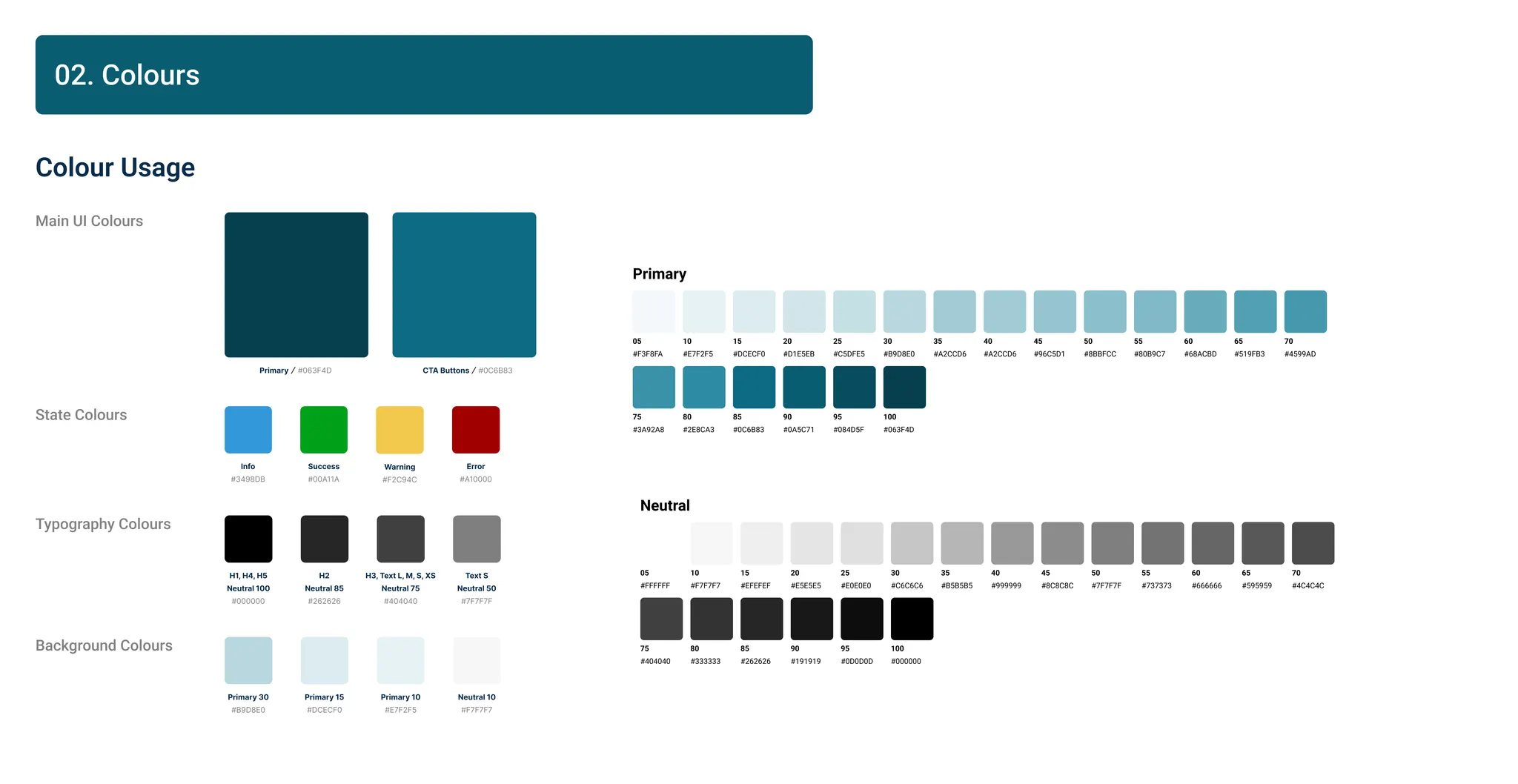
After the audit, I reworked the foundations of the design system, starting with colour tokens, branding, and semantic structure. I used atomic design structure to the system for maximum scalability. The goal was to build something consistent, easier to maintain, and flexible enough for the new platform.
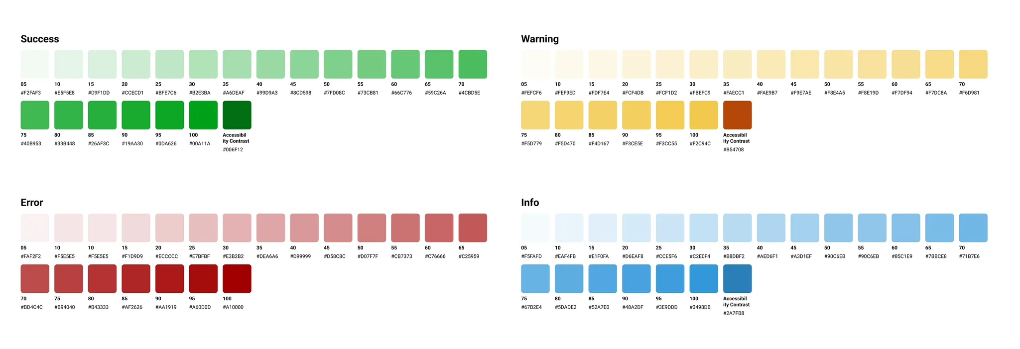
We needed a token-based colour system that worked across different surfaces, supported accessibility, and could scale into components and flows without breaking. I built semantic tokens first (primary, surface, success, error, etc.) and then connected them to base palettes.
This gave us a more stable foundation to build on and let us create cleaner, more modern flows for the new platform.
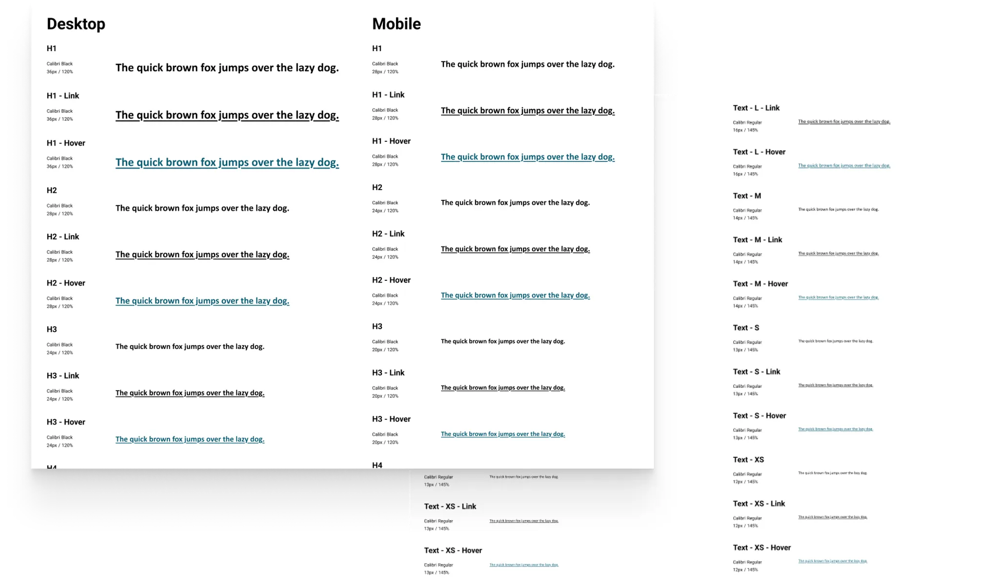
After updating the colour foundations, I reworked the typography system for both desktop and mobile. These tokens form the "atoms" of the system, which later scale into components and full templates. The previous styles had inconsistent sizes, uneven spacing, and duplicate patterns that made it hard for designers and engineers to stay aligned.
Typography was also standardised using repeatable patterns from Practical UI, which ensured hierarchy behaves consistently across all page templates later in the process. The new type scale creates a predictable hierarchy across headings, labels, and body text. It reduces style duplication, improves readability, and gives the new platform a cleaner, more consistent feel. Having a stable type system also made component building easier, since every pattern now maps to a clear text style.
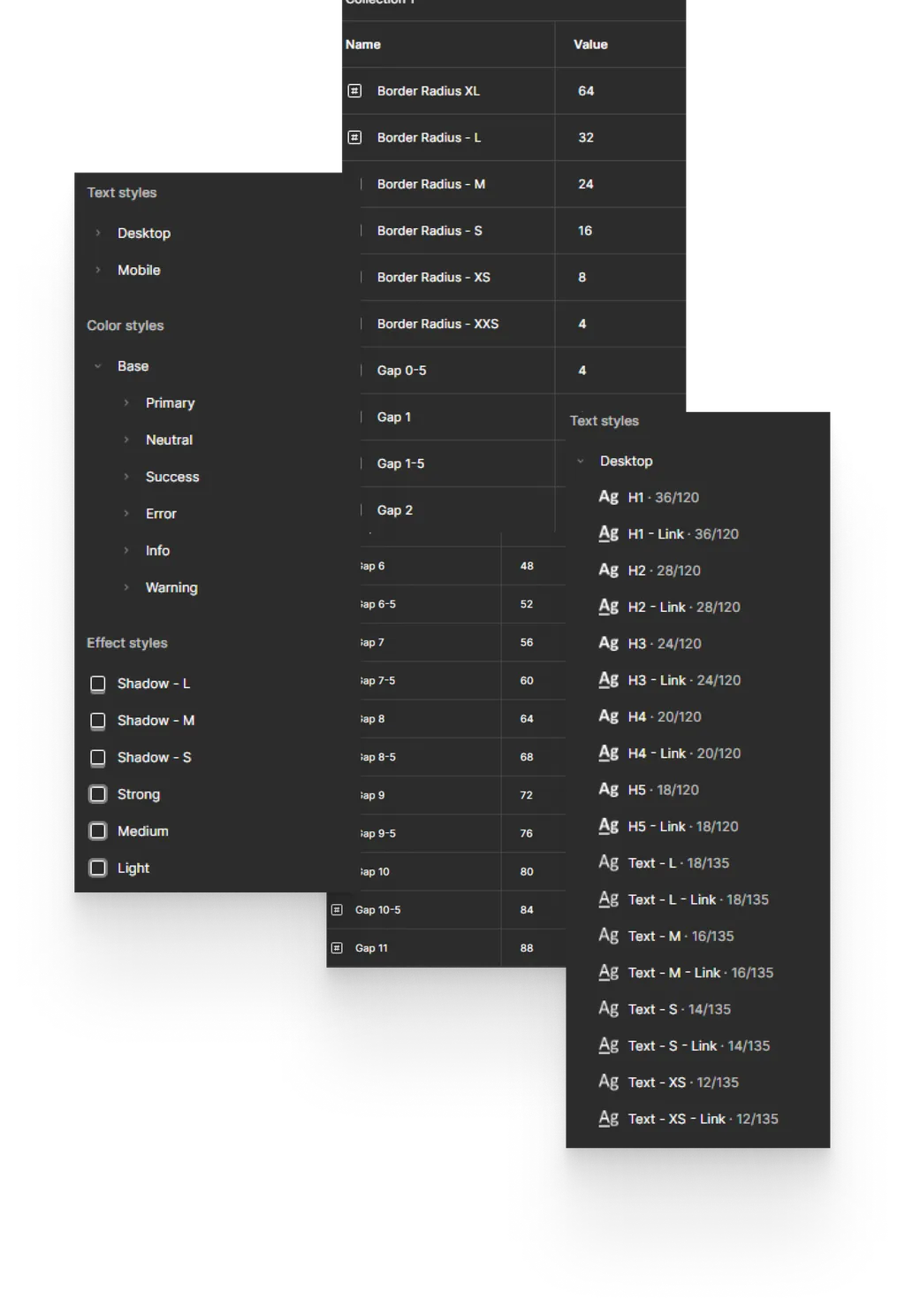
After defining colours and typography, I set up the design system inside Figma using a clean, predictable variable structure. The previous system didn't have shared spacing, radius, or colour variables, which made components hard to maintain and led to inconsistent UI.
The new variable collection uses clear naming and grouped hierarchies so the system is easy to navigate for other designers, and also works well with MCP and AI tools like Cursor and Claude Code. These tools rely on predictable naming patterns (spacing/*, radius/*, color/*) to automate layouts, generate components, and support future theming.
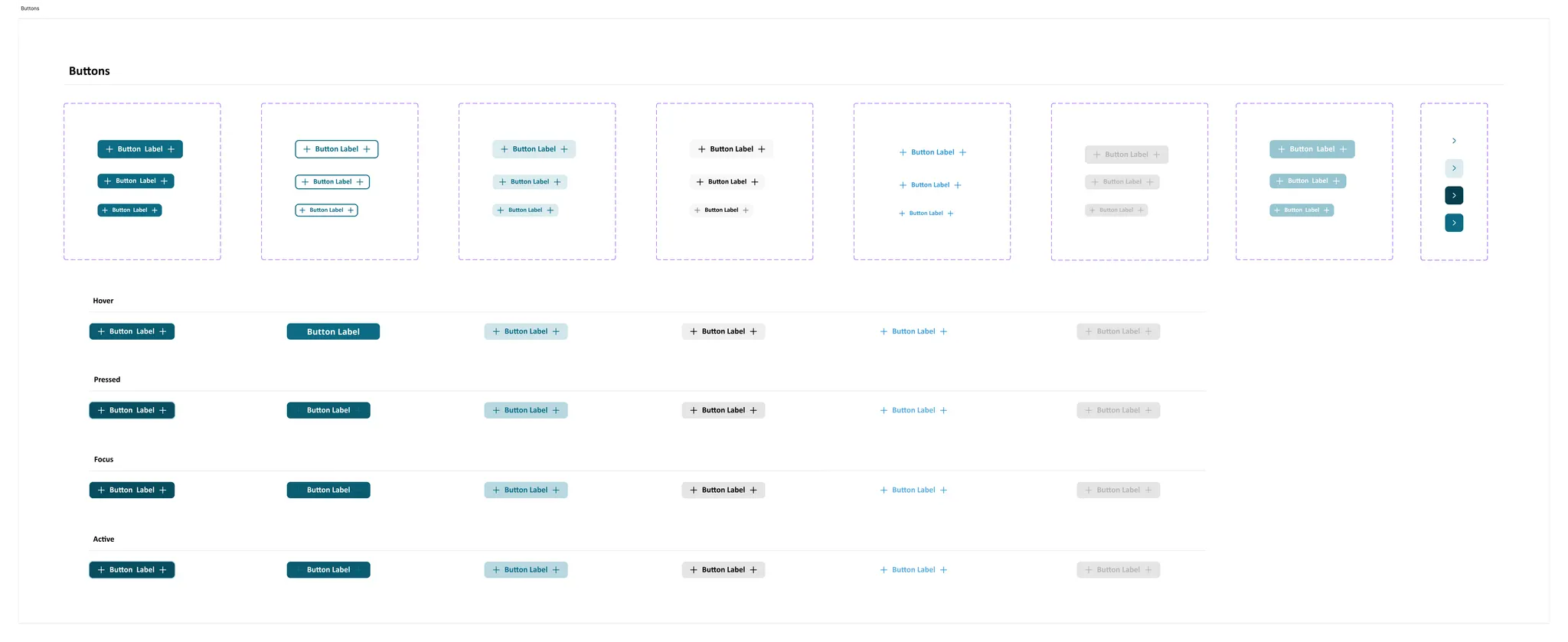
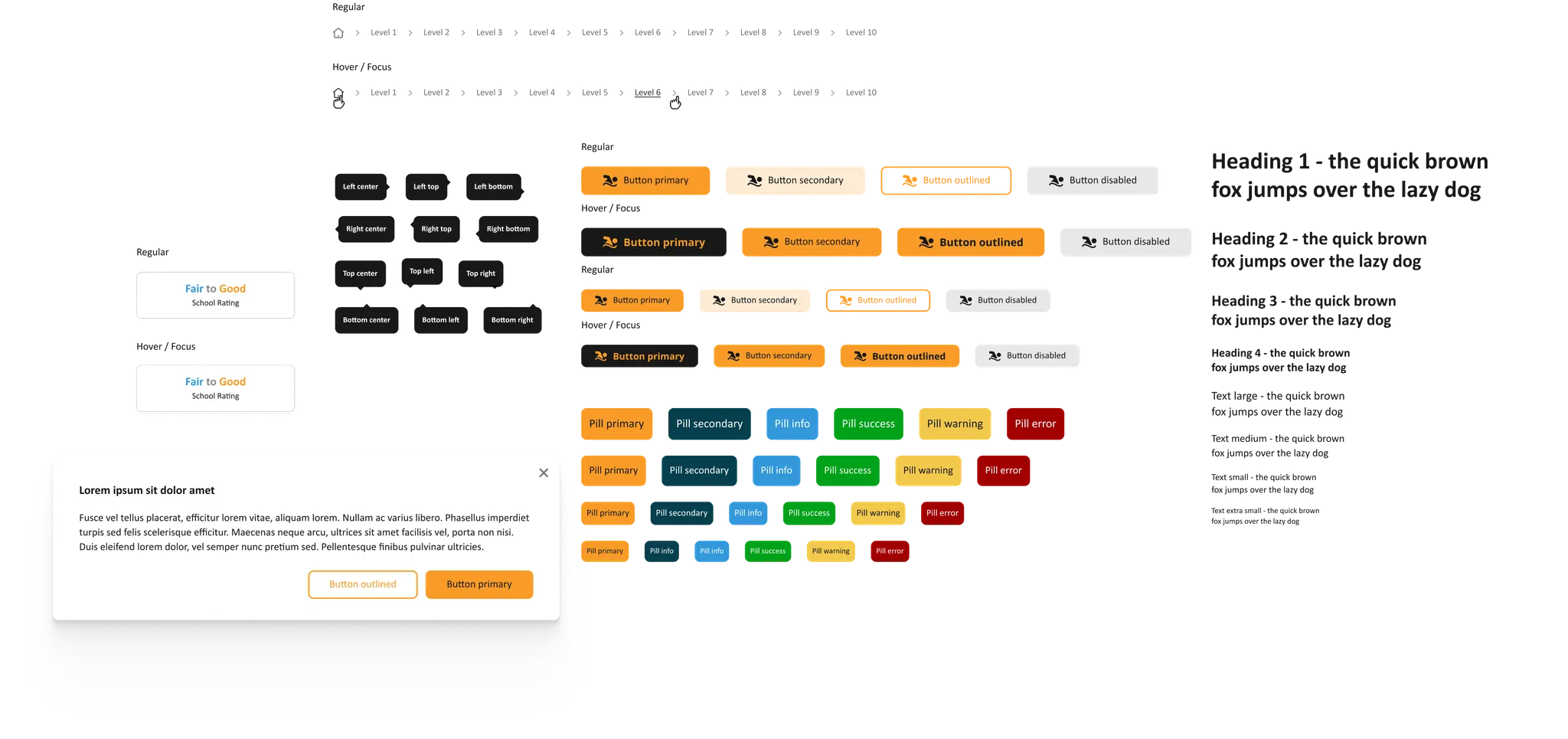
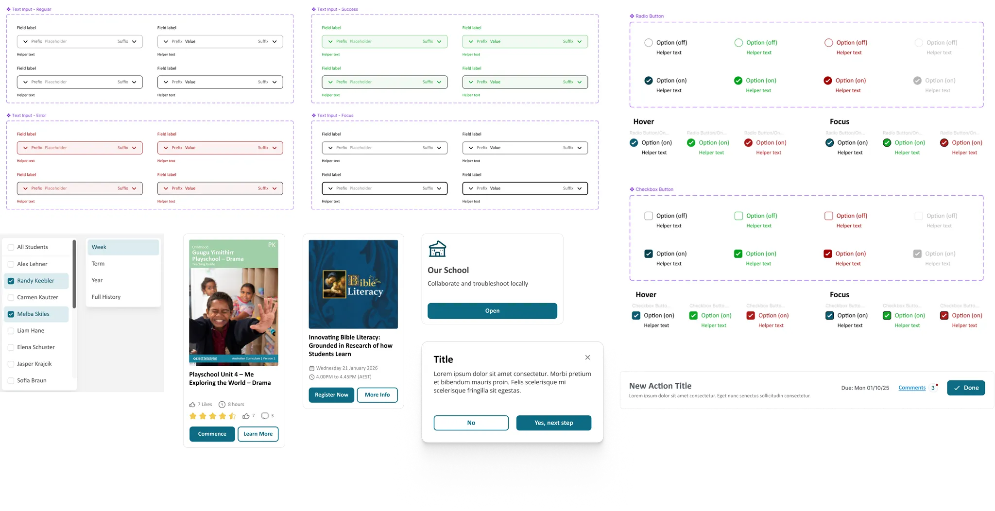
Once the new tokens and variables were in place, I rebuilt the component library so everything aligned to the same spacing, typography, colour, and interaction rules. I used parts of Untitled UI as a baseline reference for structure and naming, then adapted and expanded it so it fit the needs of the GGSA platform. This helped speed up the early setup while still allowing the system to evolve into something custom, consistent, and easy for others to maintain.
Buttons, form inputs, radio buttons, dropdowns, and cards were all redesigned to use semantic colour tokens, shared spacing, and consistent radii. Every component has clear states (hover, focus, pressed, disabled) and follows the same logic, which makes engineering handoff simpler and improves long-term scalability.
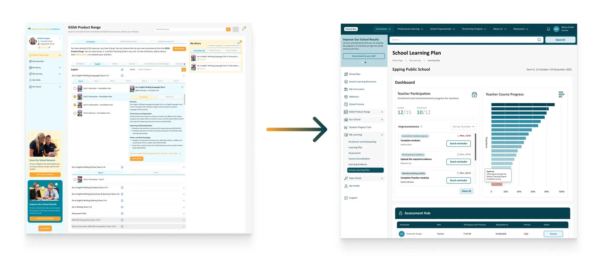
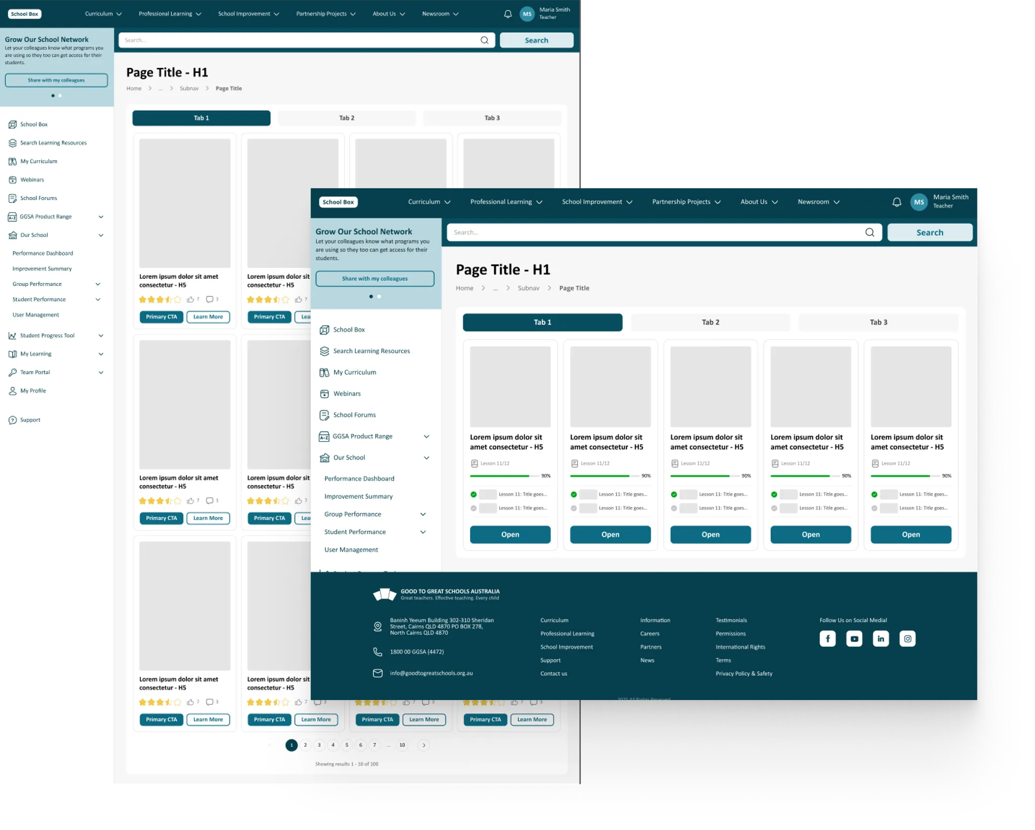
With the foundations in place (tokens, variables, components), I moved into applying the system across full page templates. I structured the build using an atomic design approach, starting with atoms (buttons, inputs, labels), then building molecules and organisms, and finally full screen layouts.
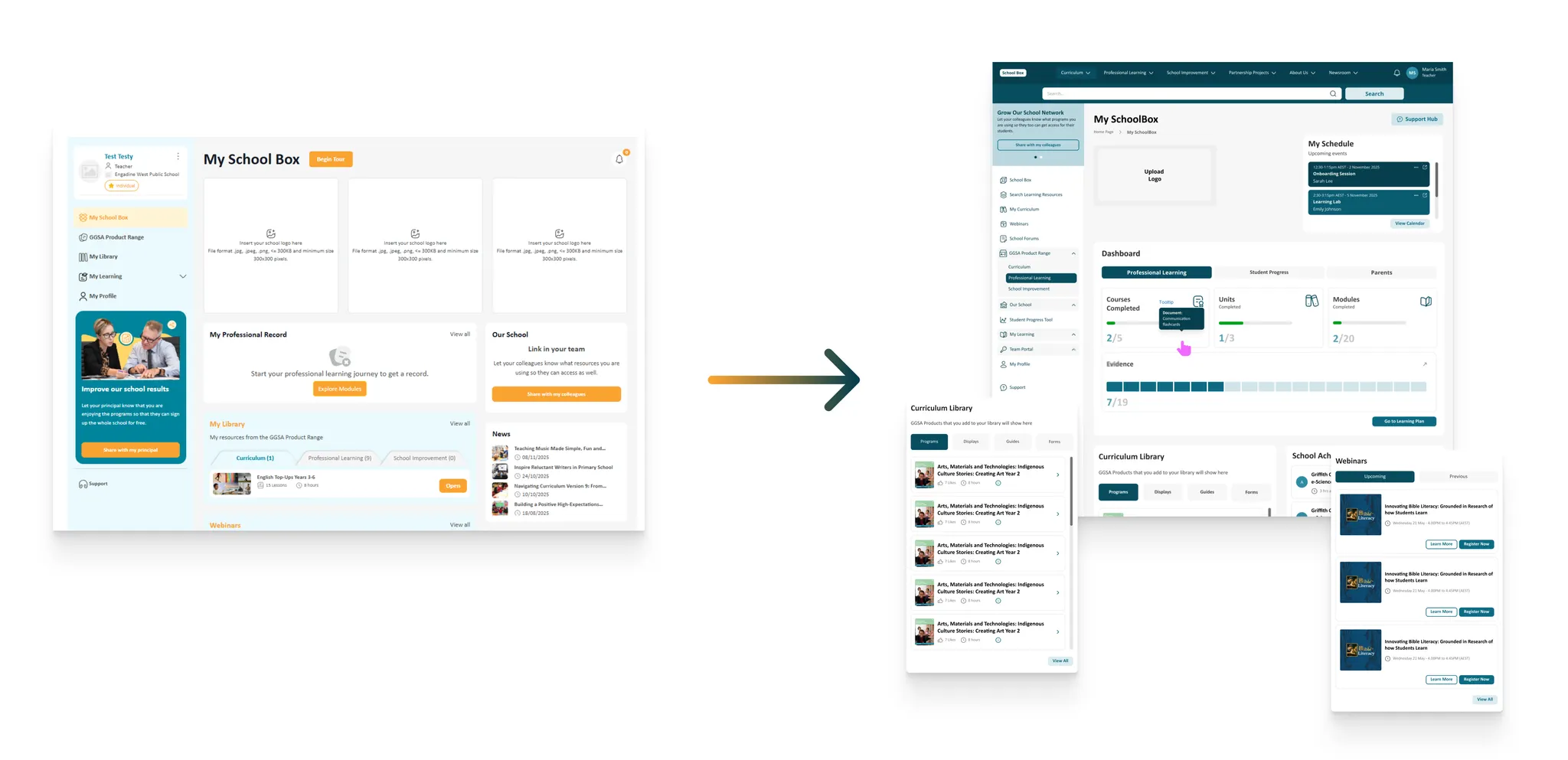
These screens weren't designed in isolation; they're the result of a system-first workflow. Once the components were aligned, creating larger flows became much faster and far more consistent. Every template here is built directly from the shared design library, which ensures the platform scales cleanly as more pages and modules are added.
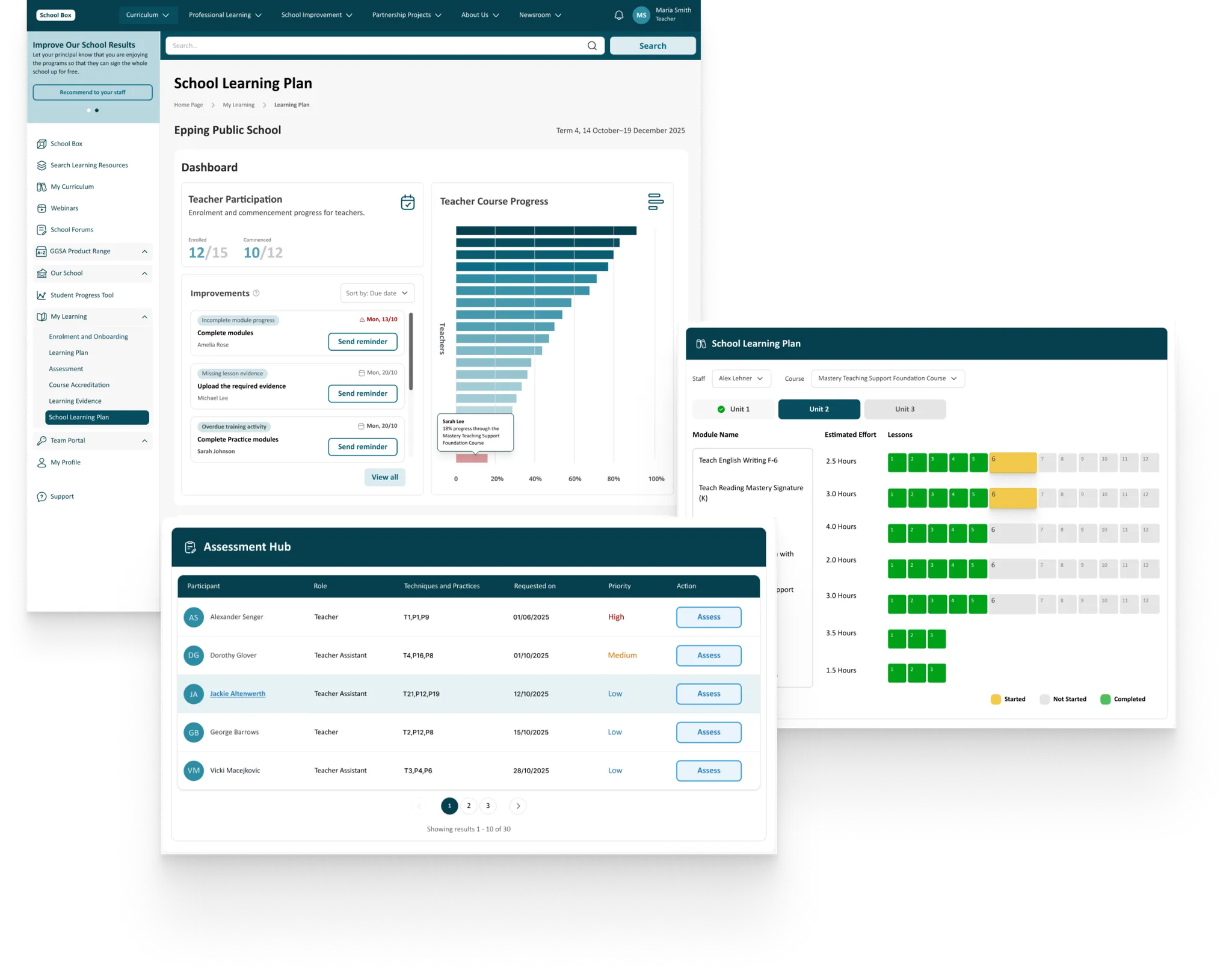
These final screens show how the updated design system comes together inside real product flows. Everything here is built directly from the same tokens, variables, components, and templates, the same way a scalable white label platform needs to operate. Rebuilding GGSA's system taught me how to move fast while keeping quality high: aligning UI foundations, making reusable patterns, and rolling them out across multiple parts of a product without losing consistency.