Project description
Overview
Foragecaster is 4-year research project with leading-edge industry and academia working on creating an accurate livestock supply forecaster using the best of breed domain models with machine learning.
As a part of the project, I designed research-driven interfaces that translated complex data into practical, user-friendly tools for farmers. By conducting user interviews and collaborating with research teams, I ensured that advanced models were accessible and actionable for effective farm management.
Problem
In agriculture, accurately predicting pasture growth is essential for managing livestock and ensuring sustainable land use. Farmers need reliable insights into forage availability to make timely decisions on grazing, feed supplements, and herd management.
Without accurate predictions, they risk overgrazing, underfeeding, or having to deal with feed shortages, all of which impact farm productivity and profitability. The challenge lies in the complexity of modeling factors such as weather variability, soil conditions, and plant growth stages, which all influence pasture growth.
Solution
Foragecaster is a predictive tool designed to give farmers a clear, data-driven forecast of pasture growth rates over upcoming months. It uses a combination of weather data, soil conditions, and pasture types to provide predictions that reflect both expected growth and uncertainty.
By presenting information visually through interactive graphs, Foragecaster allows farmers to assess pasture availability, make informed decisions on livestock management, and better plan for seasonal changes. This tool provides a user-friendly interface that simplifies complex data, making it accessible for those without a technical background.
My role / responsibilities
In this project, my role involved research and the design of the ForageCaster interface. I was responsible for creating a responsive, intuitive interface that would effectively communicate complex data in a clear and accessible way.
This involved designing interactive graphs to display predictive growth rates and uncertainty intervals, as well as integrating user interactions for filtering and customizing data views. Throughout the project, I collaborated closely with farmers over interviews to ensure the interface met user needs, iterated based on feedback, and tested the tool to ensure accuracy and usability.
Research and understanding the agricultural landscape
To effectively design ForageCaster, I immersed myself in understanding the agricultural industry, particularly the challenges of pasture growth management. This stage involved extensive research into pasture biology, the needs of farmers, and their day-to-day workflows.
I read agricultural reports, explored similar tools, and spoke directly with farmers in frequent interviews to gain insights into their pain points and emotional motivations. This foundational knowledge helped me empathize with farmers' challenges and design a tool tailored to their needs.
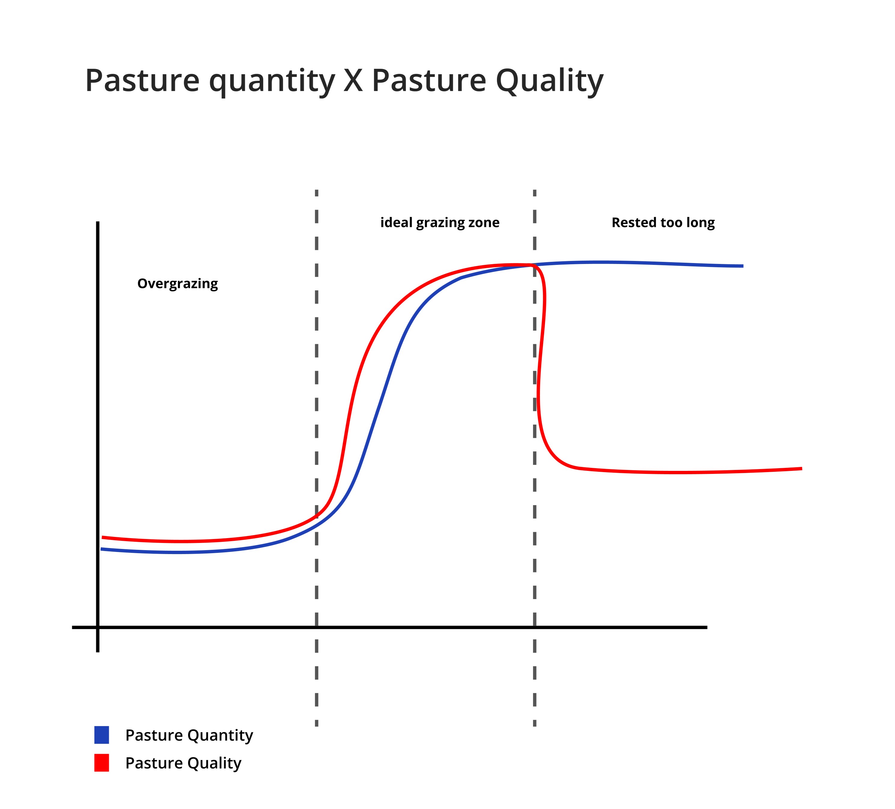
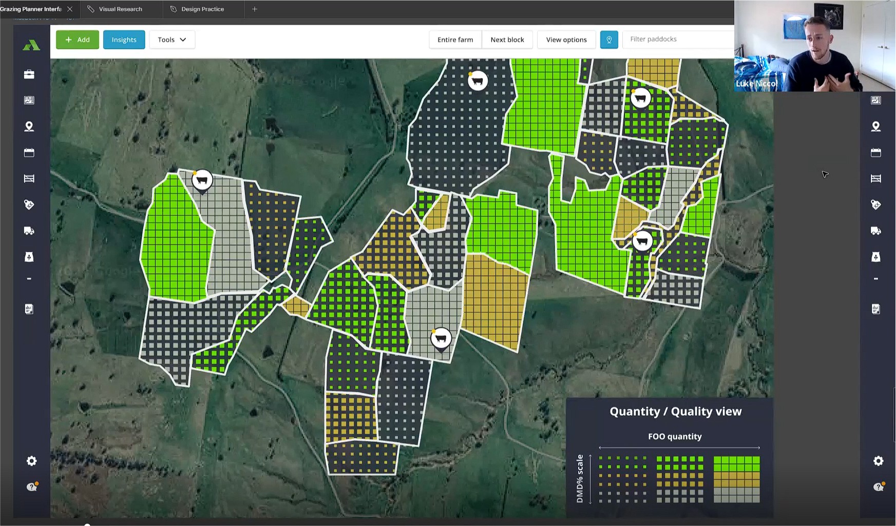
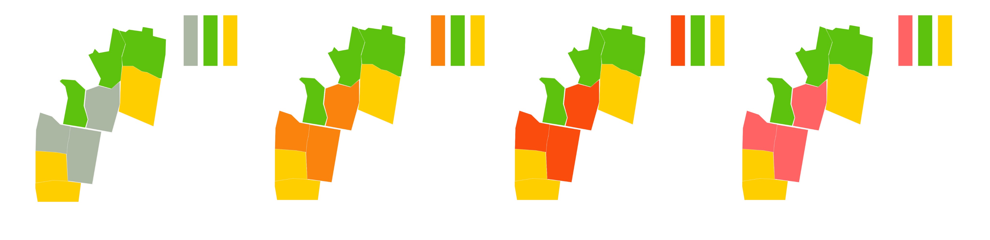
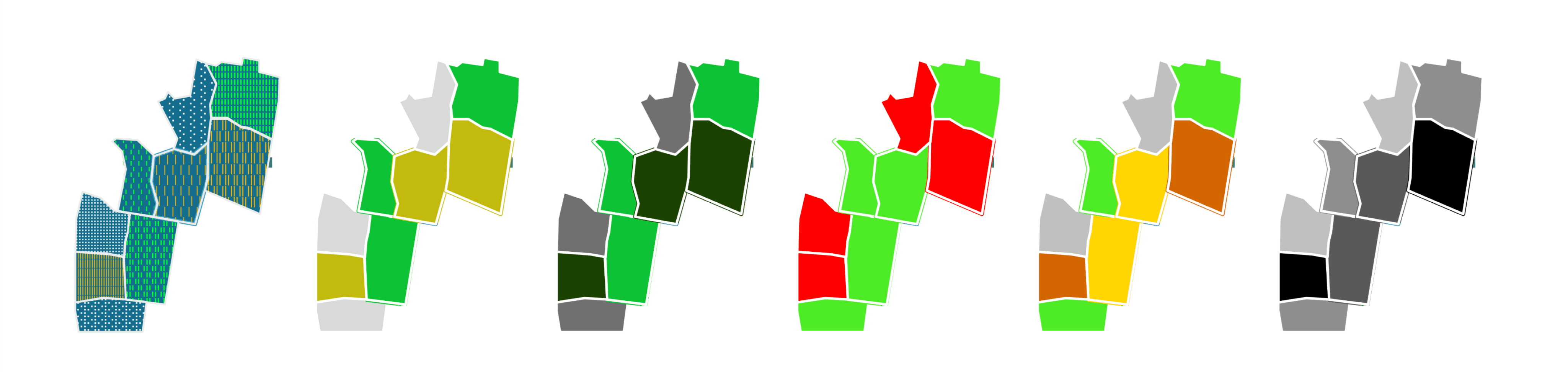
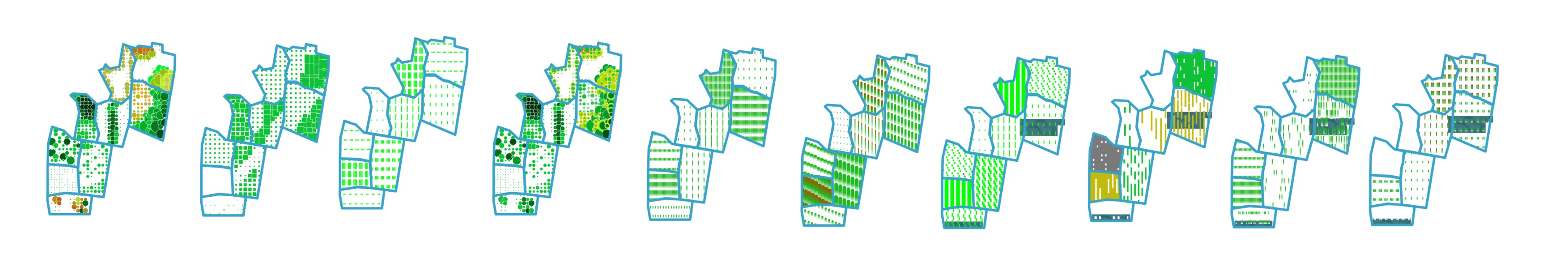
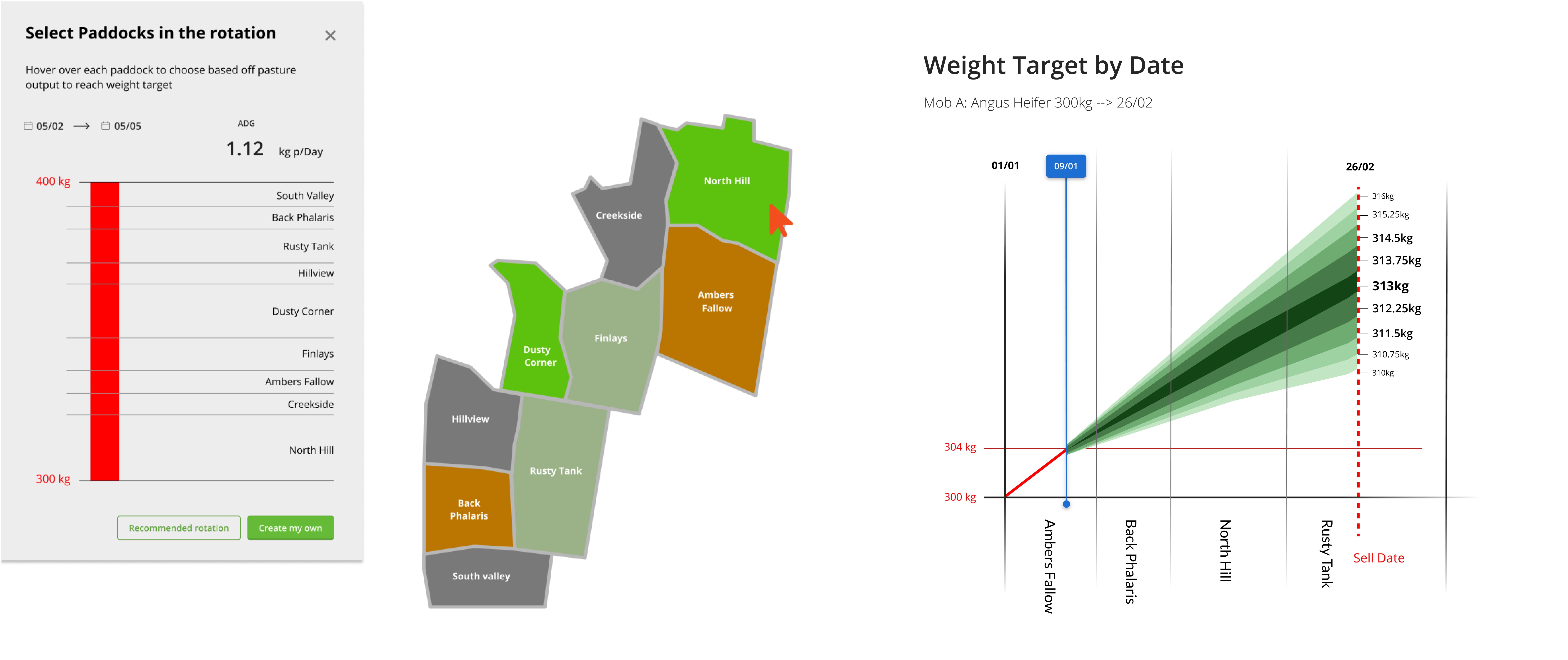
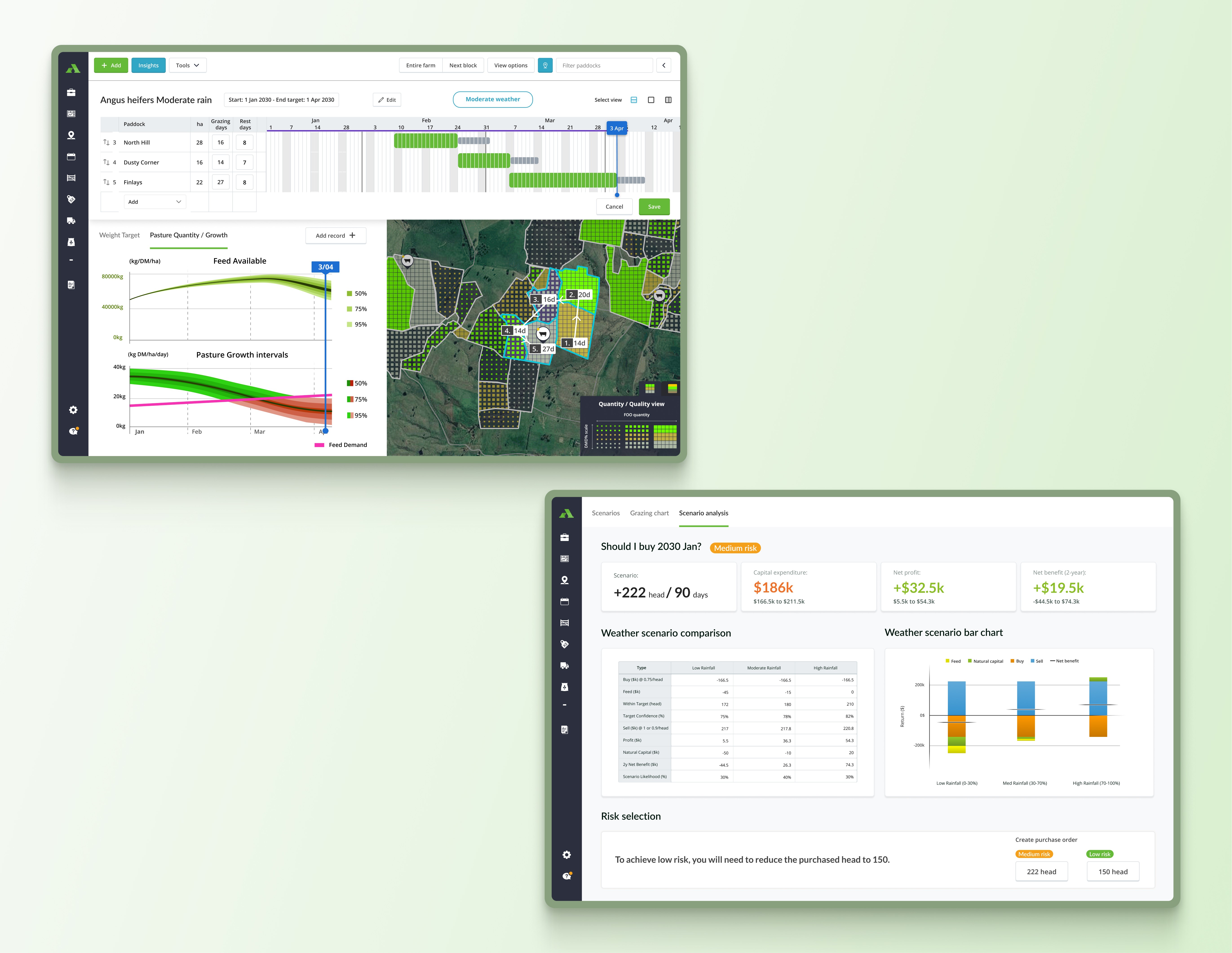
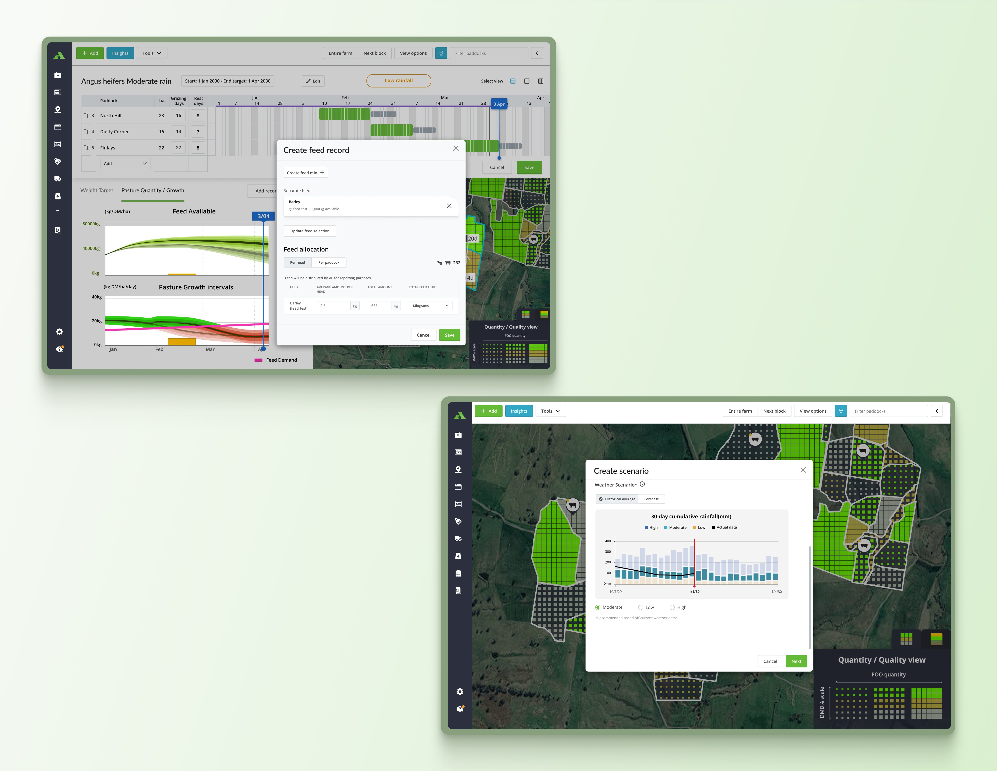
Visualising pasture on the map
To make ForageCaster an intuitive tool, I began by designing a visual system to effectively communicate pasture quality and quantity on a map. This involved extensive research to understand how best to represent pasture data, exploring visual options like color gradients, density markers, and layering to ensure clarity and ease of interpretation.
With each iteration, I experimented and refined these visuals based on feedback, adjusting elements like color, transparency, and symbol size to enhance user understanding. Through ongoing testing, I transformed initial concepts into a polished, user-friendly interface that balances visual appeal with functionality—illustrating the importance of research and experimentation in creating an impactful visual system.
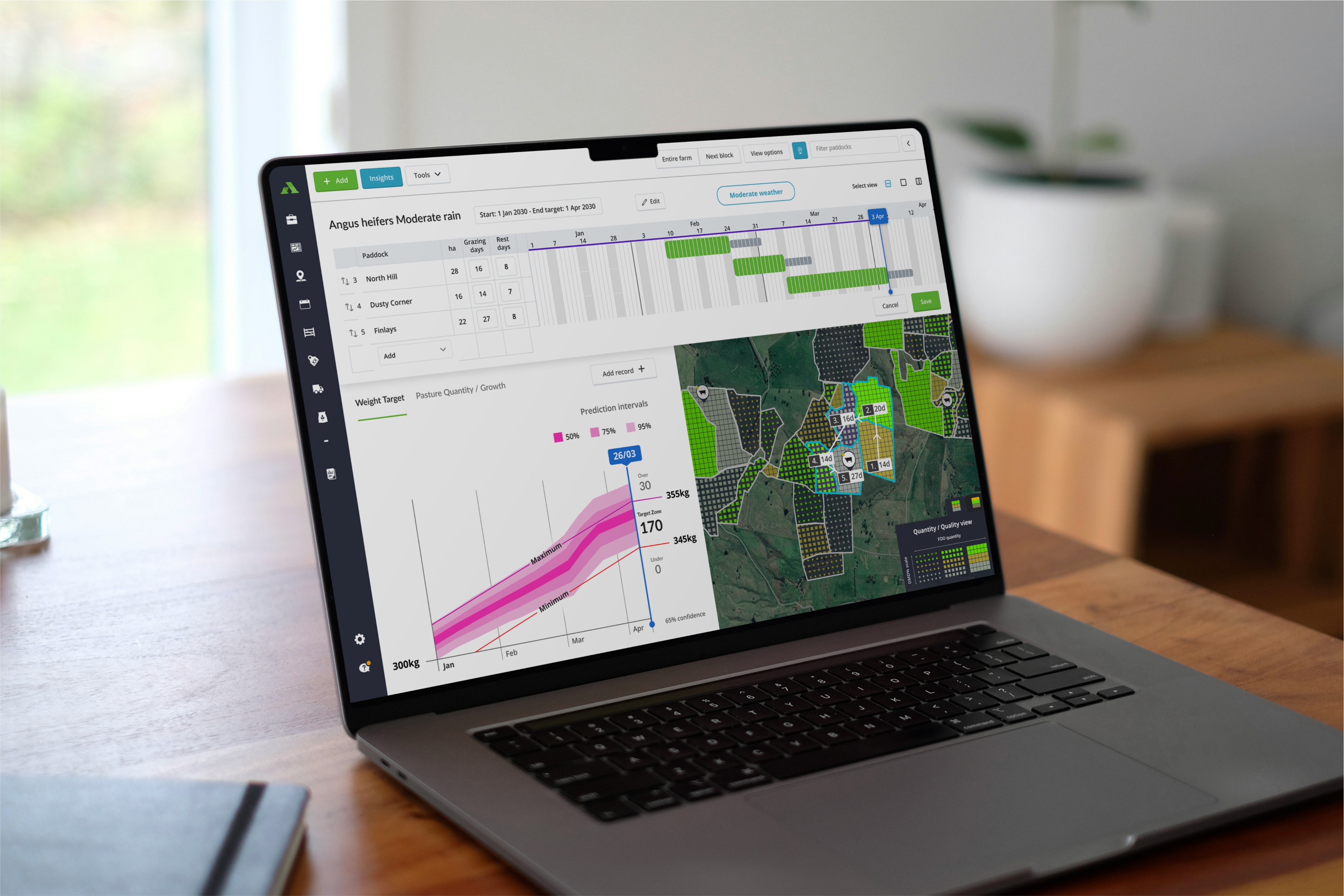
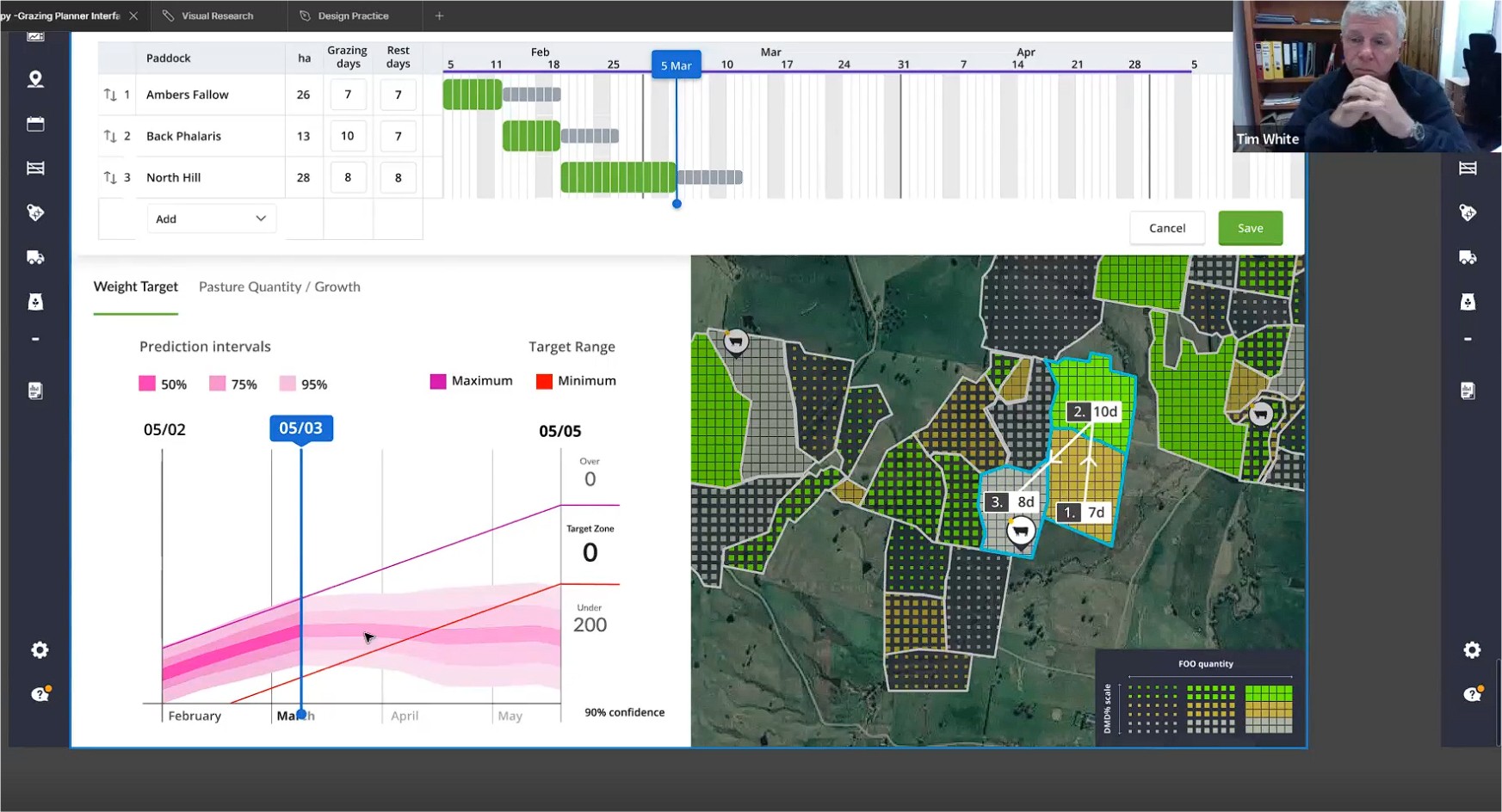
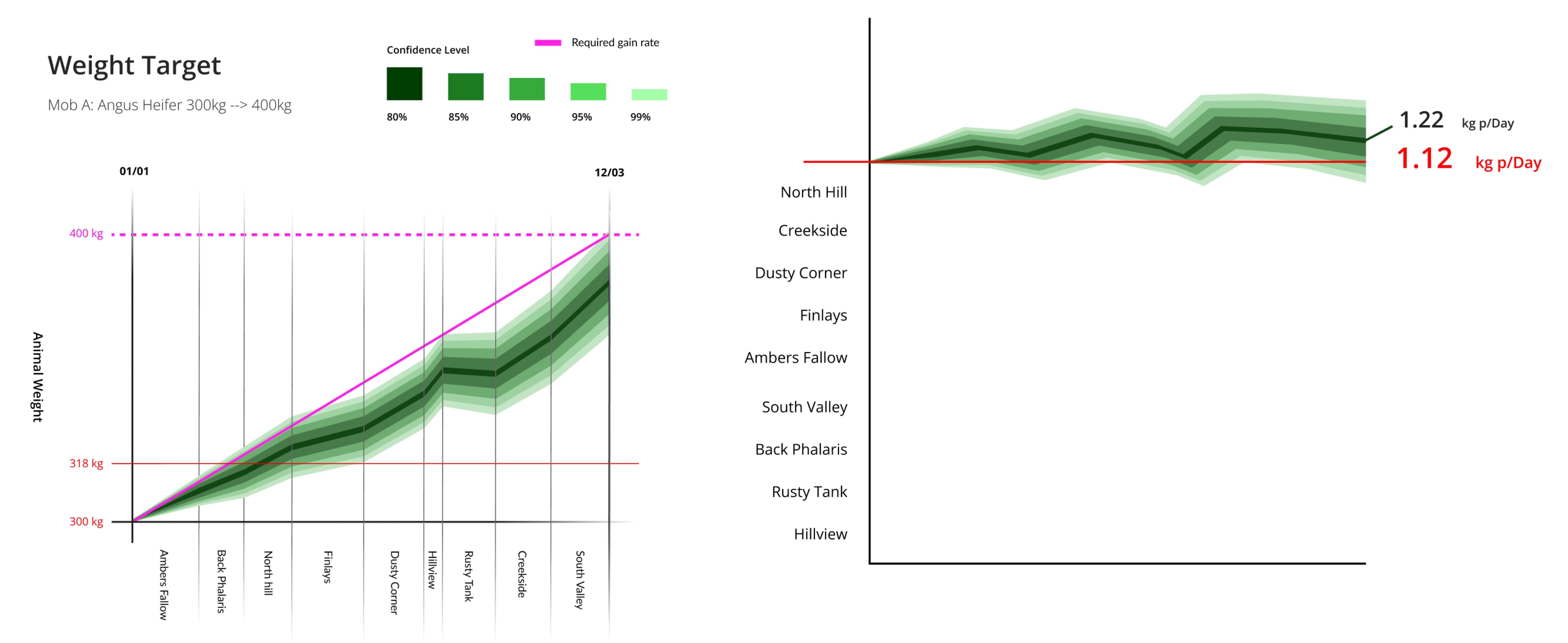
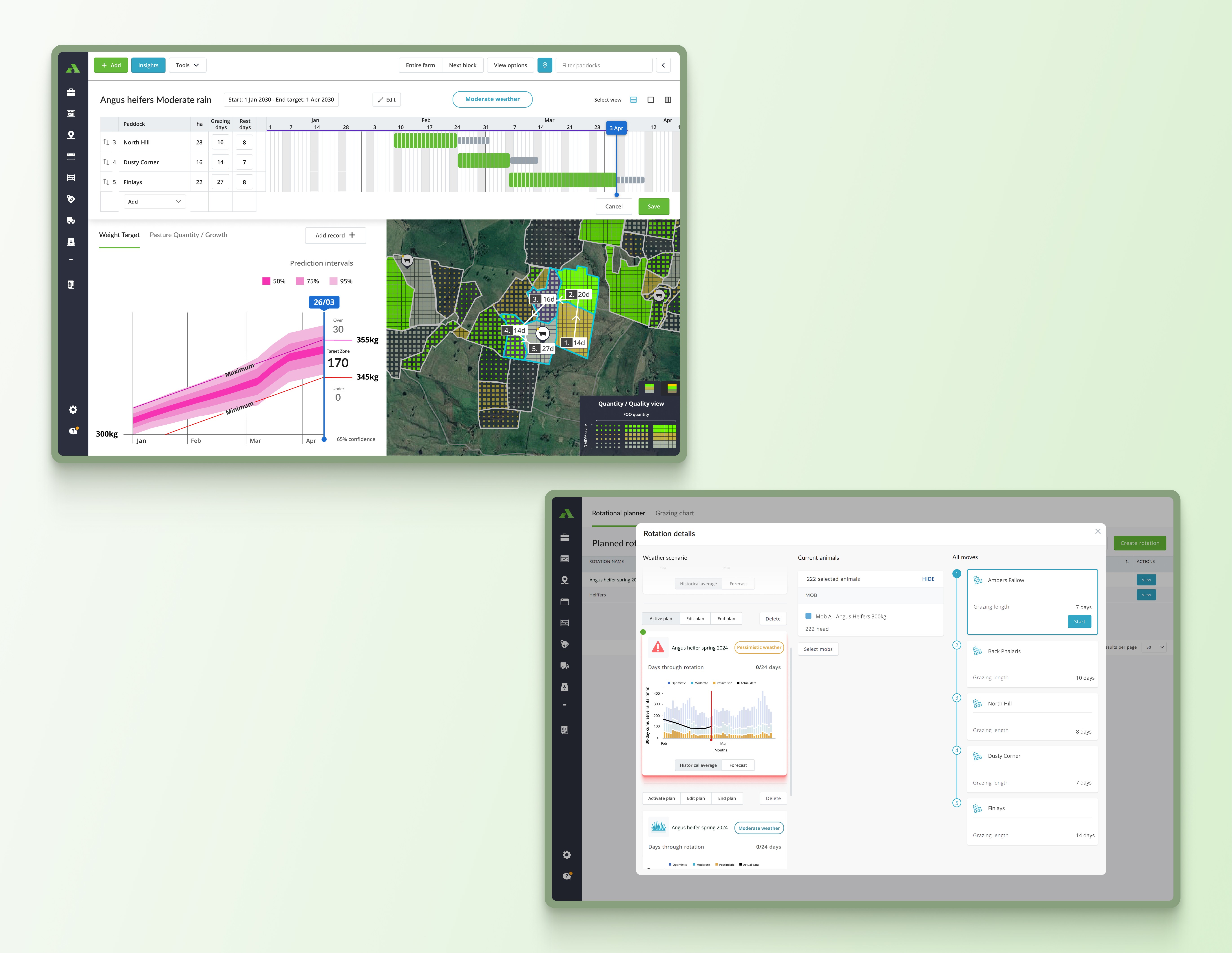
An interactive weight gain graph
To provide deeper insights into livestock management, I designed interactive weight gain graphs that visually represent the potential weight animals could gain based on the paddocks they graze in.
This feature allows users to view projected weight outcomes as they relate to pasture growth rates, helping them optimize grazing decisions. Developing these graphs involved testing various methods to display growth trends and uncertainties, including confidence bands and density shading to clearly indicate the range of possible outcomes.
Each iteration focused on balancing accuracy and usability, ensuring that the graphs were both intuitive and adaptable to user needs.
By enabling users to adjust timelines and explore projections interactively, the graphs became a practical tool that connects complex data with actionable insights, giving users a clear view of both current conditions and future expectations for livestock growth.
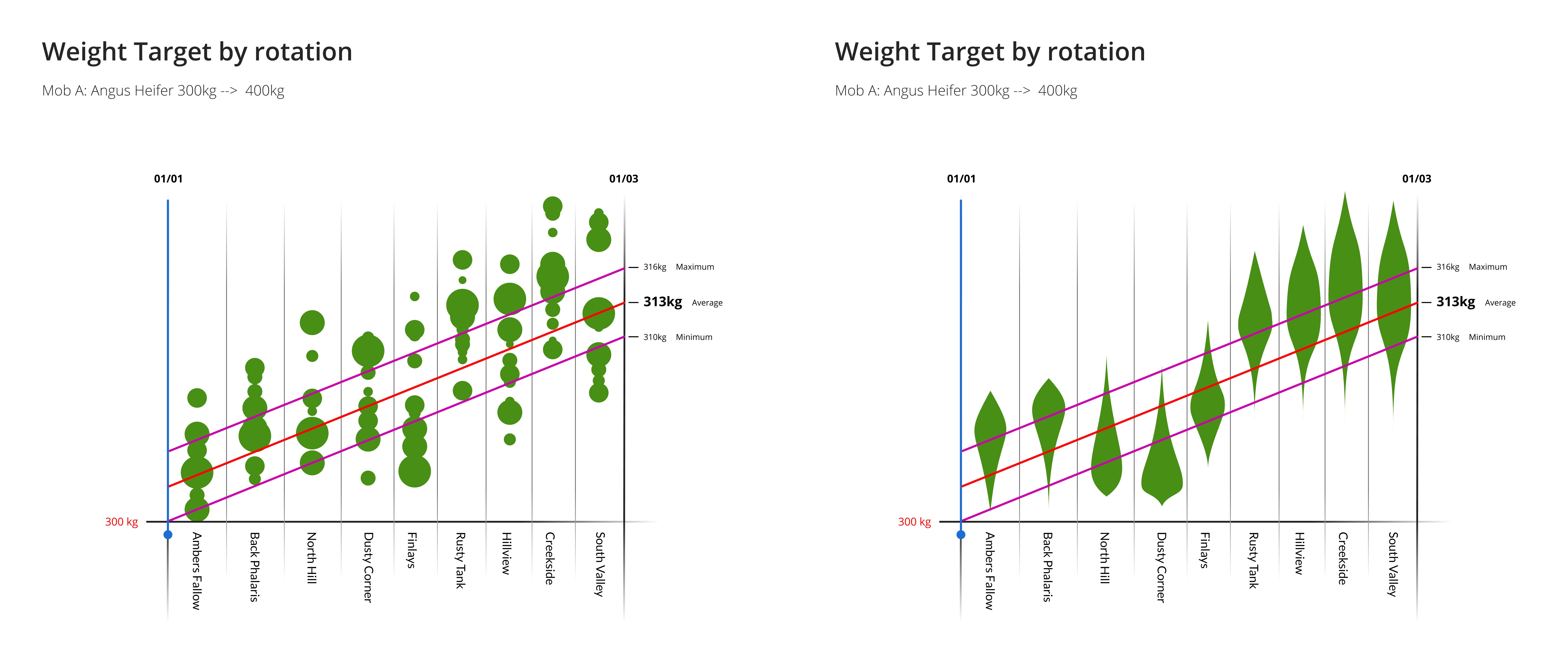
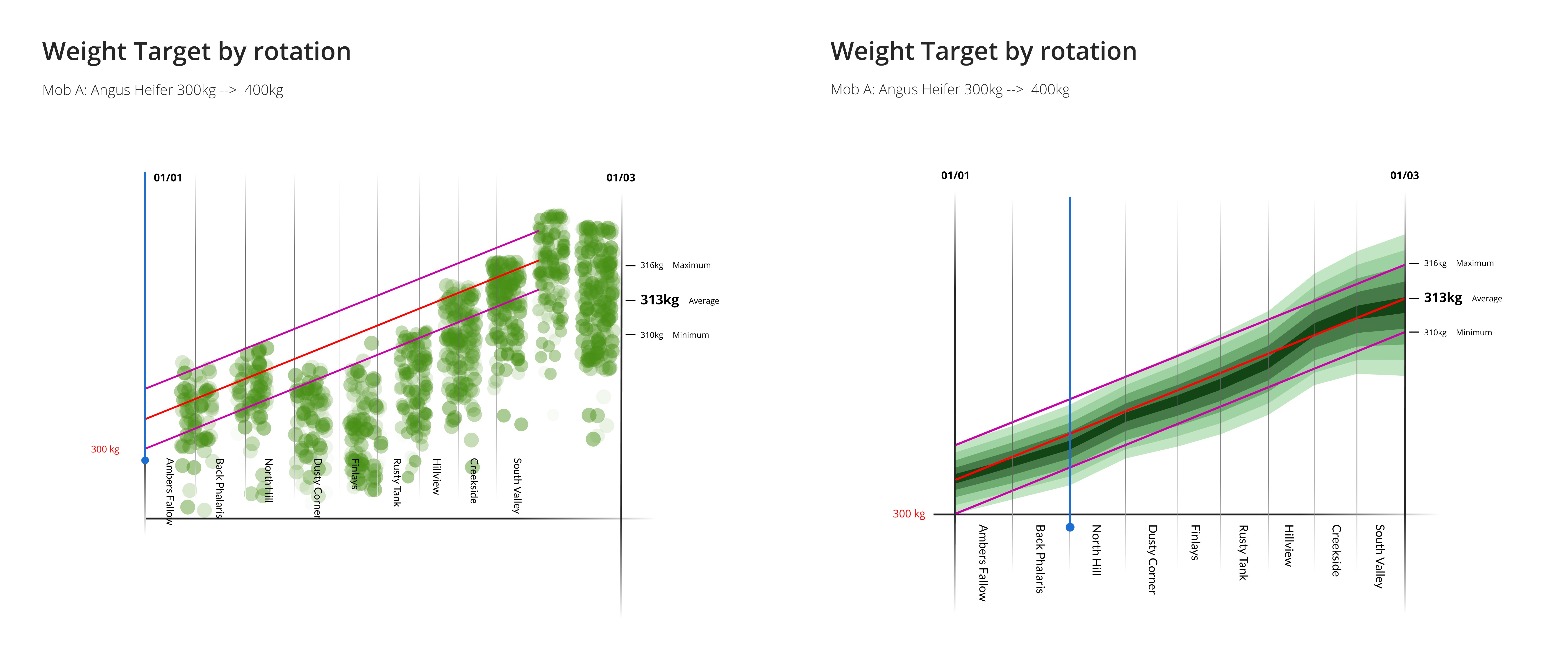
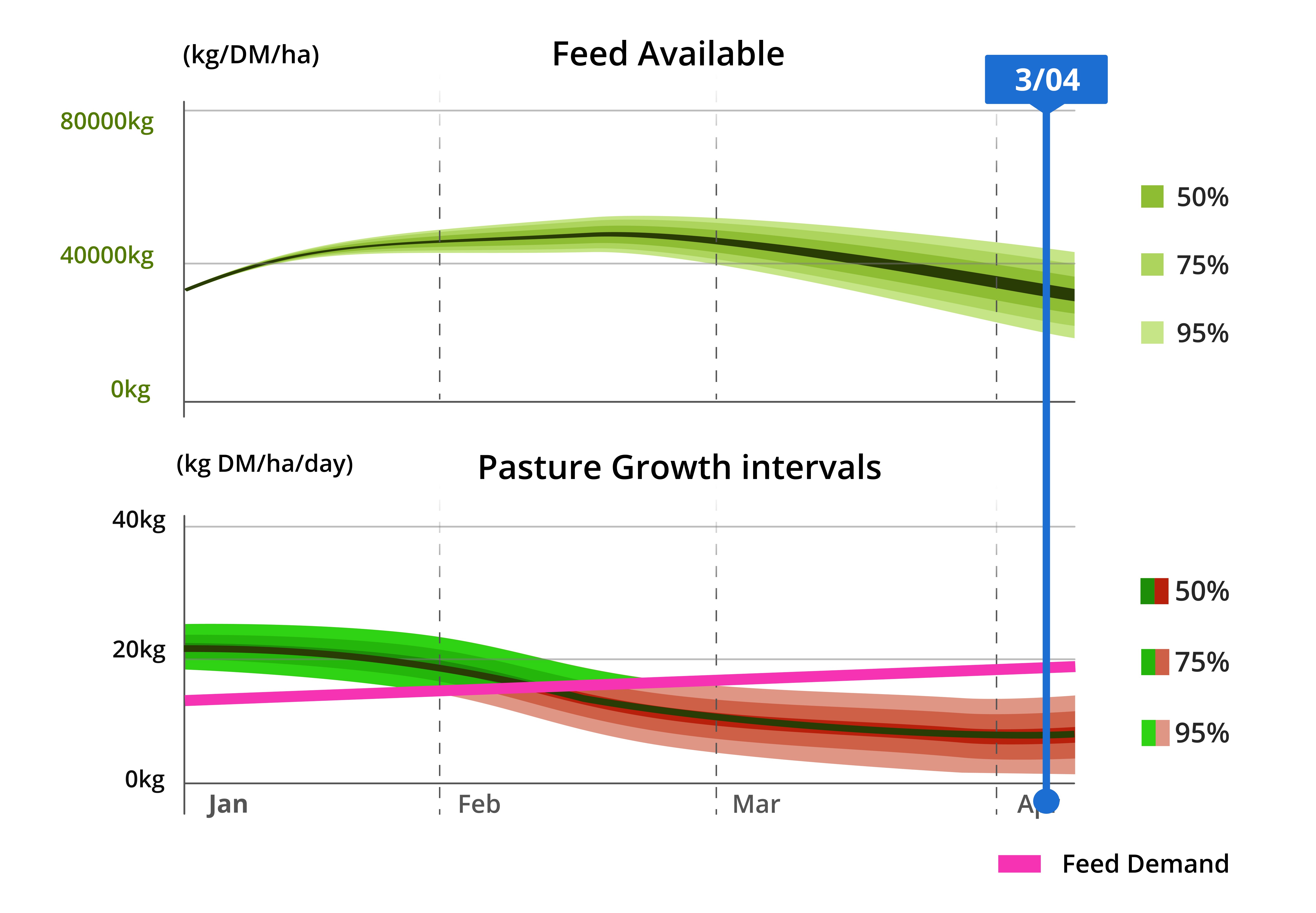
Visualizing pasture growth over time
In addition to weight gain insights, I developed tools to represent pasture growth rates, providing users with a clear view of available forage over time. The pasture growth graphs needed to illustrate growth trends and potential fluctuations across different paddocks, allowing users to assess both current and projected pasture quantity and quality.
I explored ways to visualize this data, ultimately incorporating features like confidence bands to represent predictive ranges and density shading around median growth rates for intuitive visual feedback. I found it challenging trying to manipulate multiple forms of data that are meant to be represented on the same axis sharing units but in the end I feel like the end result is intuitive.
Each iteration brought enhancements in readability and responsiveness, making it easier for users to track pasture growth over weeks or months.
By enabling interactive elements, users could explore different timeframes and projections to better plan grazing strategies. This feature transformed complex growth data into a visually accessible tool, giving users the foresight to make informed decisions about grazing planning.
By integrating weight gain and pasture growth visuals into the grazing planning flow, ForageCaster provides users with a complete toolkit for managing livestock and pasture health.
These interactive elements allow users to make data-driven grazing decisions, aligning animal growth with pasture availability to optimize land use. This integration empowers users to anticipate outcomes, adjust grazing strategies, and ultimately achieve a balanced, sustainable approach to livestock management.